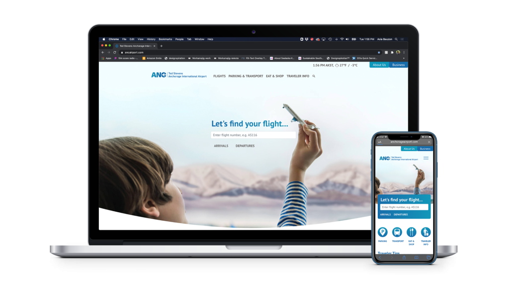
MSI became Ted Stevens Anchorage International Airport’s communications partner in 2019, and we embarked on a rebranding journey. Our goals included simplifying the airport’s tongue-twisting name and designing a mark that was bold, easily recognizable and reflective of the airport’s global cargo potential.
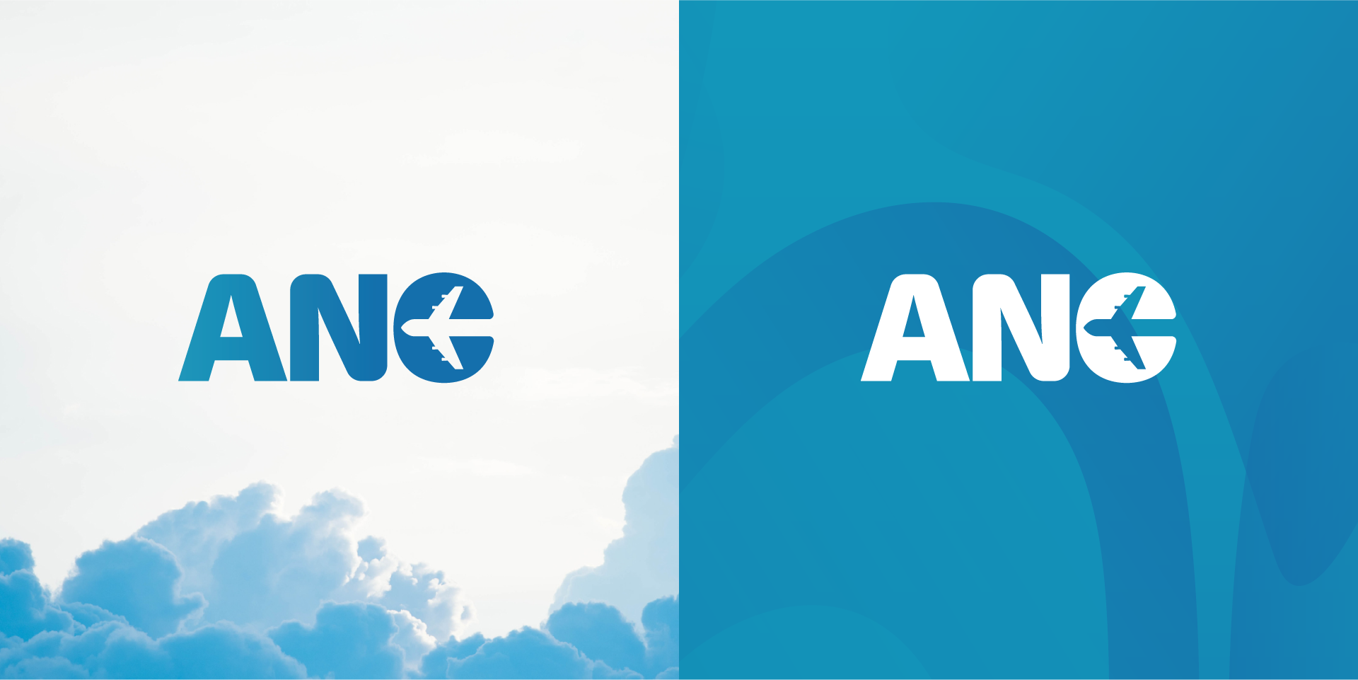
Research showed more airports were dropping their formal names in favor of their three letter air code – ANC in the case of Ted Stevens. It was also apparent that blue is the favorite color of airports, so we worked to find a blue that was complementary to that of Alaska’s official color yet distinctive enough to set ANC apart from its competitors.
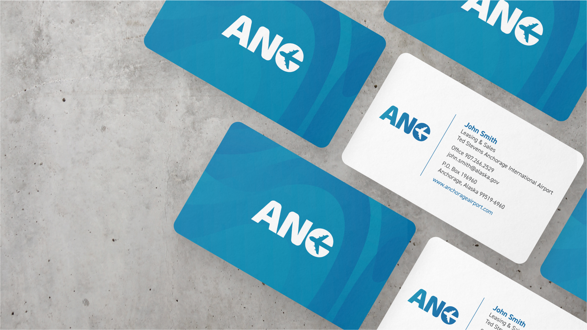
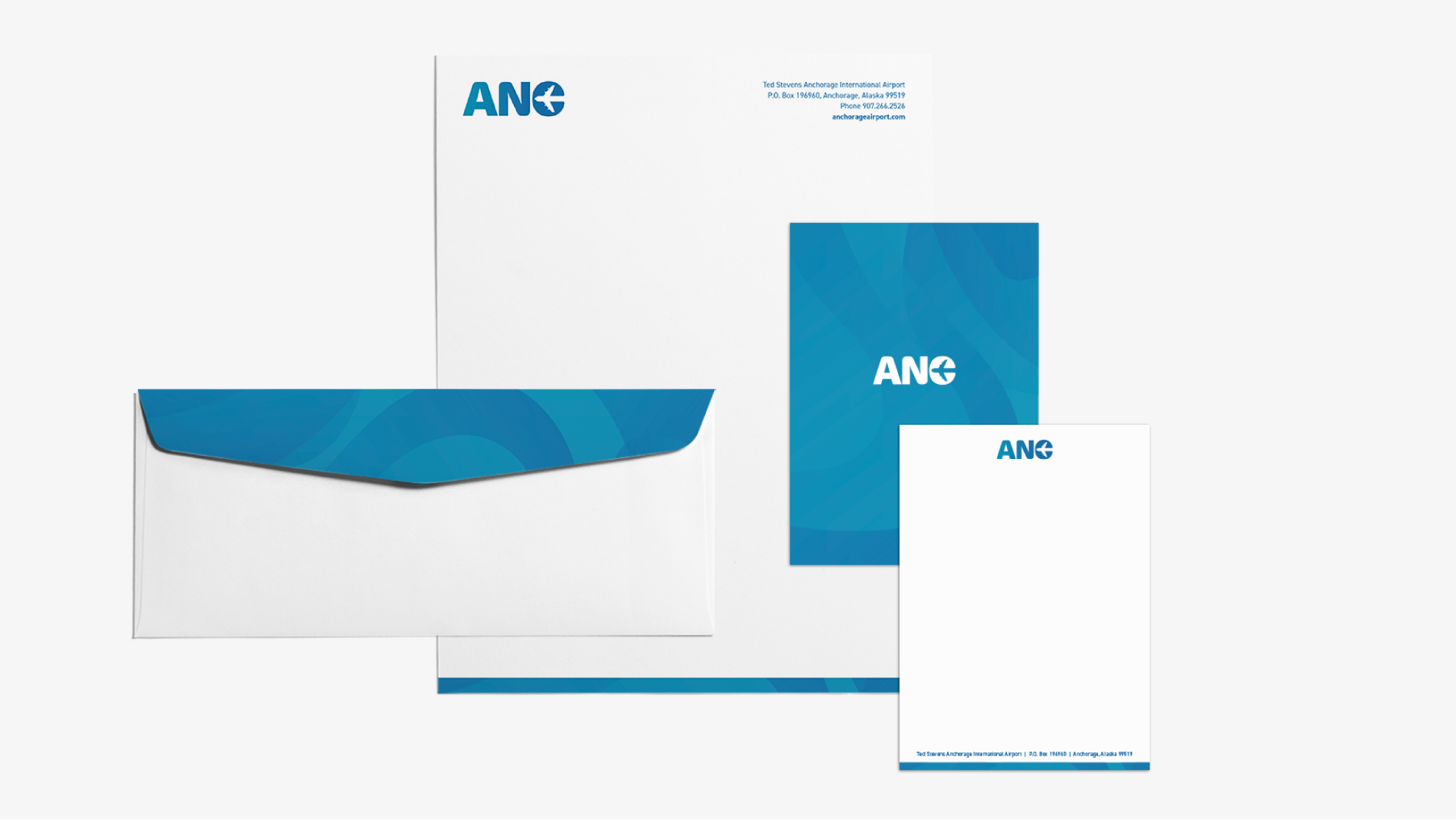
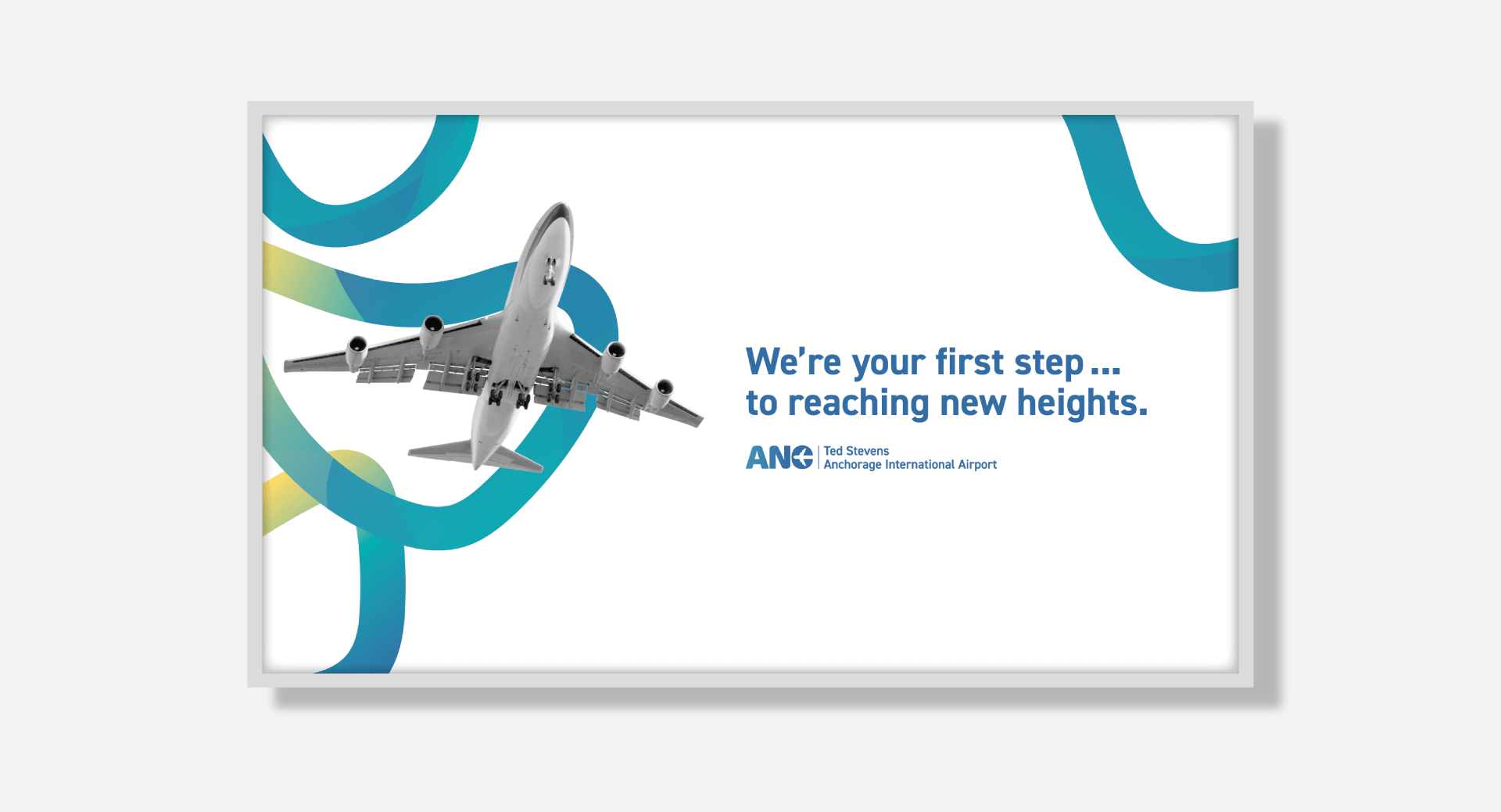
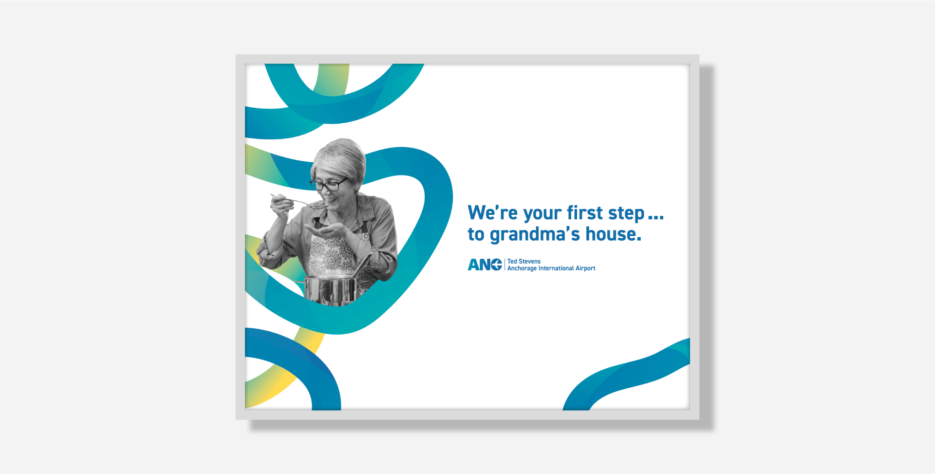
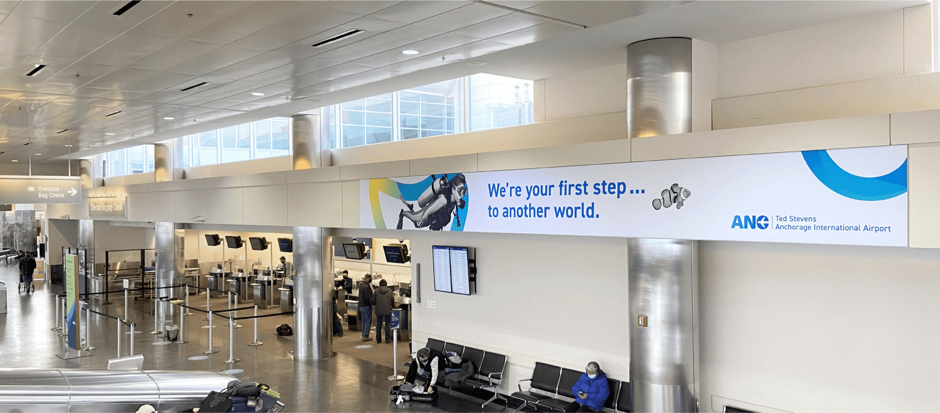
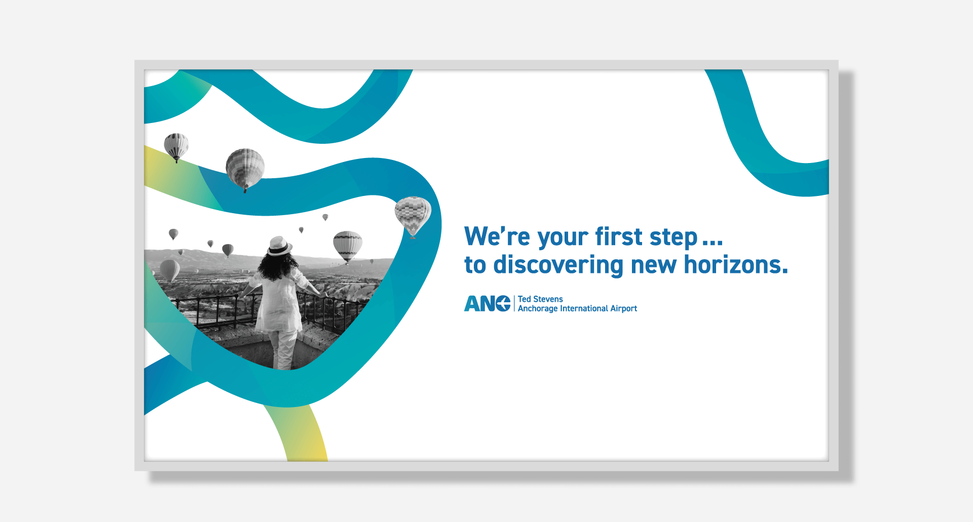
MSI engaged in an extensive review of the existing brand and previous communications activities, as well as a full-day site tour to visit each respective operational section of the airport to ascertain their priorities, sensitivities and audiences. Back in the office, MSI’s creative director challenged the entire art department to come up with logo designs that featured the letters ANC and had a palette similar to what the airport already used. In the end, the client selected a bold, modern mark with the silhouette of a four-engine, 747 wide-body cargo plane embedded in the C. Once the mark was selected, we started to build out the brand, including a new tagline: “World-Class. World-Close.”
![]()